
O
O is a series of three works built around the same luminous circular form. Pink, red and yellow each shift the atmosphere in a different direction, while the composition remains deliberately restrained. Colour carries the energy; scale, negative space and repetition keep it controlled.

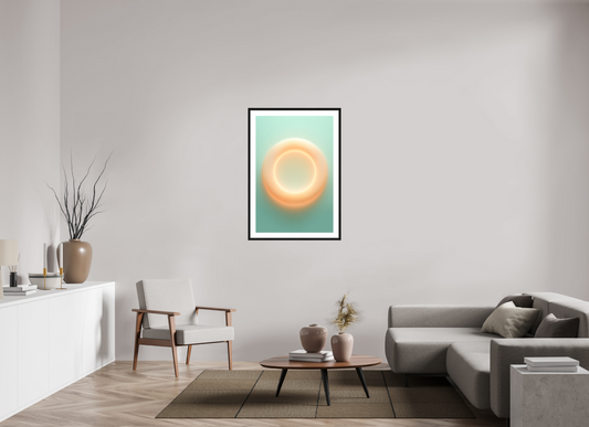

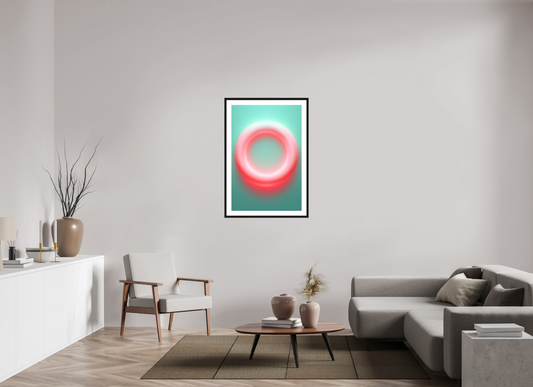

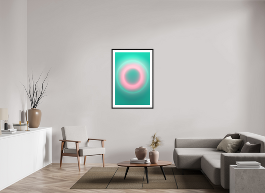

Same form, different colour
The structure remains constant across the three works, but colour changes the way it is read. Pink feels softer and more diffused, red more concentrated, yellow brighter and more immediate. Because the form barely changes, the differences between the works are experienced less as changes in composition and more as shifts in visual temperature and attention.

Colour without noise
O was developed around the idea that strong colour does not need to dominate a room. Set against architecture with enough breathing space, the circular field becomes a point of focus while the surrounding materials and proportions remain visible. The work introduces colour decisively, but the room does not need to compete with it.
O in your space
Scale, light and surrounding materials can significantly influence how the work is experienced. We can help you select the most suitable artwork, size and placement, and create a complimentary visual mock-up using a photograph of your wall or interior so you can see how O could work within your space.

Related collections

